
Industry
Cybersecurity
Year
2020
Skills
Interaction design
Visual design
Prototyping
Pattern library enhancement
Overview
This was version one of a brand new product offering in an enterprise suite of cybersecurity apps. This new product fits under the category known in the cybersecurity space as User and Entity Behavior Analytics (UEBA). The goal of the app is to prevent stolen credentials and guard against malicious behavior from a known user. The app learns a user’s typical behavior by taking in his or her keyboard, mouse, network, and app usage to assign a confidence score. If the user’s confidence score falls below a certain threshold, then that user could be automatically logged off and forced to reauthenticate or could be locked out.
This project showcases my interaction and visual design skills. I worked with a product manager who set the requirements. This design effort expanded the existing pattern library in the form of new page layouts and filter patterns. Much of the screens have been generalized in order to comply with the NDA agreement.
Solution walkthrough: Happy path of a security analyst
This is a walkthrough of the product’s main screens as it would be used by a security analyst, the primary user. The security analyst starts on the home screen, which provides easy starting points for two common use cases.
Use case 1. If a Security analyst does not know where to start, he may use the following sections to help him.
Dashboard. This shows a trend of the kinds of alerts occuring in an an environment and the number of devices that are active. An aberration from the norm may trigger an analyst to dig deeper and understand the cause of the deviation.
Top Ten Lists. Located below the dashboard, there are three lists that highlight users of concern. For example, the analyst might want to look into users with the lowest scores.
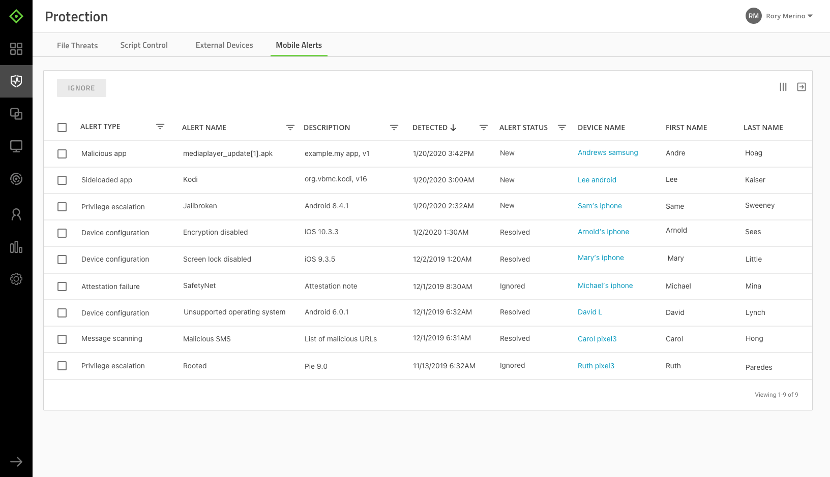
Alert List. On the left side of the screen, the alerts are ordered by severity– highest to lowest, and then by time–newest to oldest. This ordering helps prioritize what the analyst needs to review.
Use case 2. If a Security Analyst knows exactly what she is looking for, she will use filters to isolate the alert.
Filters. The analyst can isolate a particular alert based on certain attributes like the type of alert, time of occurence, severity, status, or username.

Getting more context about an alert on the details page
After isolating the exact alert, the analyst may want more context around what is happening. By clicking on the alert, the user brings up the details view where she can access the following three sub-sections under “Additional Context.”
User’s Trust Score Log

Related Alerts

History & Comments

Alert management: Changing the alert’s status
The main action the security analyst does from this app is to change an alert’s status to indicate where it is along a work queue. Here it has been changed from “New” to “Reviewed”, meaning it has been handled.

Another Use Case: Controlling the model’s sensors
On a user’s detail screen, the Security Analyst is able to pause or reset the sensors used to create the Trust Score. This functionality is provided to help isolate a specific sensor to make sure it is scoring accurately. Also an analyst may want to pause or reset a sensor in the event of a known rollout of new devices. For example, there might be a rollout of new keyboards and therefore an analyst would want to pause or reset the keyboard sensor so that the Trust Score remains accurate.
In this example, the sensor
“Logon” is paused. This means that the app has paused collecting data about the user’s logging in behavior.

Early wireframes exploring layout
Design challenges explored in early wireframes addressed:
- Page layouts that included data visualizations and the alert list
- How a user would interact between the alert list to a detailed view of an alert
Wireframe A. Staying close to existing patterns used in the platform
Stats of interest display at the top of the page, and below that, a data table lists the alerts (left image). When a user clicks on an alert, the details animate from the right side of the screen (right image). The data table and details panel exist in other parts of the platform, so this version stays close to existing patterns.


Wireframe B. Alerts grouped by work status
This version is similar to A, but instead of a data table, the alerts are organized in columns by work status (left image). This layout is common in work queue systems and though it could be helpful, this was tabled because it was not a primary use case and would need further thought on how it would scale over time.
The alert details display in a new tab (right image).


Wireframe C. Easy access to search and filters
After some customer interviews, the product manager confirmed that searching and filtering would be one of the most common tasks analysts would do, so making it easy became a priority.
This is the layout direction that went into the final design. As shown below, the alert list displays on the left , while stats display to the right. When a user selects an alert, the details display where the stats once were. The user can close the details view and the stats would display in it’s place.


Grouping alerts could be valuable but tabled for further validation
Another idea explored in this round was grouping alerts. This could be beneficial especially when handling large volumes of alerts. This concept was tabled for further validation since there could be many different use cases in which to group alerts.
In the example, alerts are grouped by the same Username that occurred within the same hour. The default view is to collapse the alerts, and the user could expand the cards to see the other alerts.

Pattern library & styleguide enhancements
Existing pattern
A. Alerts display in data rows
New pattern
Alerts display in cards with severity made visually prominent

B. Data tables

Card list

C. Filters accessible in each column which makes it difficult to view and apply filters
Filters centrally located at top of page make it easier to view and apply a filter


D. New filter type: Multi-select with a typeahead search box based on Material Design

E. New colors added to styleguide

F. New data visualization patterns
