
Overview
This project is a redesign of a cybersecurity dashboard for an enterprise SaaS app primarily used by Security Analysts trying to keep their organization’s environment safe. Many customers did not find the current dashboard useful. It did not provide actionable information that addressed their most common use cases and it showed retrospective data that was not relevant. Therefore, the main goal of the new dashboard was to make it more useful to Security Analysts.
This project demonstrates my capabilities as a full-stack designer as I led every step from discovery through redesign.
The content has been asbtracted in order to be compliant with the NDA agreement.
This case study has three sections:
Skills
Interviews
Survey design
Product hypothesis formation
Persona development
User testing
Low to high fidelity mockups
User-centered design advocacy
Industry
Cybersecurity
Year
2019
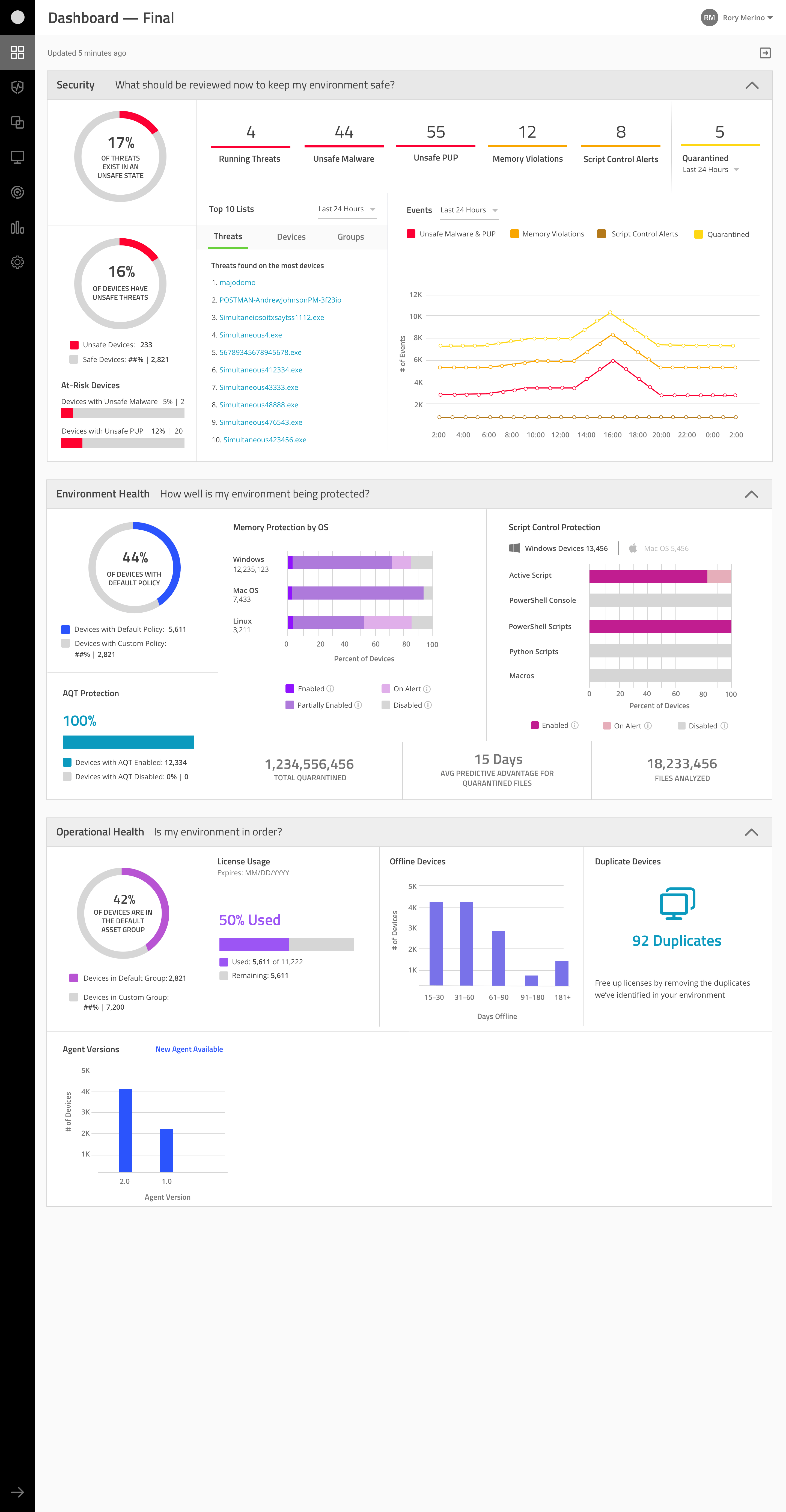
Old Dashboard

New Dashboard (partial view)

DISCOVERY:
Framing the Problem
&
Defining Requirements
Interviewing an internal subject matter expert, blurred for privacy.
1. Gathering Data

Interviews to understand current dashboard experience
• 11 Subject Matter Experts
• 5 Customers
In order to improve the dashboard, I first needed to understand the customers’ current experience of it. To do this, I interviewed internal subject matter experts from Sales Leadership and Customer Support via video meetings. These also better prepared me for customer interviews.

Surveys to prioritize which solutions offer the most value
• 37 Internal Sales Engineer Team
• 22 Customers
After getting a better understanding of the major pain points, I needed to prioritize those problems. To do this, I created two surveys to get feedback on the most egregious problems: one for the Sales Engineering Team and another to Customers.
2. Synthesizing the Data


Biggest Pain Points
After gathering all the data, I presented my findings with business stakeholders for their input. These were the agreed upon pain points to address:
- Current dashboard isn’t supporting common tasks and doesn’t provide the ability to click-through to act on the data.
- Dashboard does not demonstrate relevant information well. For example, the count of active threats is hidden in a carousel.
- Security Analyst is the least satisfied user role and uses the console the most.
- Retrospective data that shows counts from the past year is not helpful in this context.

The dashboard should help a Security Analyst quickly grasp the current state of their environment. It should surface relevant information for common tasks and serve as an entry point for those tasks.

As a Security Analyst…
…I want to know what threats and/or endpoints need to be reviewed now to keep my environment safe.
…I want to know which systems or devices are the most vulnerable.
…I want to know how I can better protect my environment.
…I need to make sure I’m making the best use of my licenses by removing devices that are no longer being used or are duplicates.
3. Reviewed Six Competitor Dashboards
Takeaways
- All displayed security posture and provided click-throughs to resolve issues.
- Titles above each module provide a quick way to understand the value of the data presented.
- Our unique offering: Displaying operational data like license usage and app version across the organization.

DESIGN:
Explorations & Validations
Presenting a mockup with an internal stakeholder for feedback.
1. Initial Low-Fidelity Wireframe
From the data synthesis done prior, I created a quick first draft of the kind of data the dashboard could display.
In pink are the user stories and the associated numbers indicate the level of importance of that data to an analyst. For example, #1 is the most urgent to review.

2. Medium-Fidelity Mockup Informed by Subject Matter Experts
Sharing the initial wireframe with two Subject Matter Experts, resulted in the following changes:
Clearer sections based on Use Case
Data about an organization’s active threat status is under “Security;” its configuration posture is under “Environmental Health;” lastly, operational stats like license usage is under a section called “Compliance.”
New metrics added
- Operating System distribution
- Geo-location of devices in a system
- App versions active in the environment
Updated the look & feel
To begin to align more with the existing product UI, I used existing library data visualizations when available.

3. High-Fidelity Prototype to Validate with Customers via Zoom Video Calls
6 Security Analysts
3 Group Interviews
- Validate if the dashboard addresses the most common workflows for Security Analysts
- Validate if the data is being presented in a useful way
- Feedback on which visualizations deliver the most value to inform feature prioritization
High fidelity. Version #3
Final dashboard

Takeaways
- Added duplicate device data so Analyst can remove duplicates.
- Added more timeframes for Offline devices.
- Tabled the OS distribution visualization since some customers rely on other systems for this info.
- Revised visualizations about how the the security app is configured across the organization (second panel) in order to reflect the complexity of those settings.

IMPACT:
Measuring Product Usefulness
&
User-centered Design Advocacy
Presentation I gave to other product teams about user-centered design
Measuring product impact of design
In an attempt to evaluate the usefulness of the new dashboard, I had five customers rate the current dashboard to get a baseline measurement. This is a small sample size, but I made the best out of the circumstances. The average scoring was 2.5 out of 5; 1 being useless, 5 being very useful.
The plan was to reach out to the same five customers and have them rate the design after implementation. Unfortunately, the final measurement was not completed during my time.

User-centered design advocacy
In partnership with the Senior UX Director, I used this project to demonstrate the value of user-centered design methods to the larger organization. I gave presentations across departments and advocated to leadership for the design team to be able to apply better methodologies. A short-term win was getting approval to hire more designers.