
Summary
This project’s focus was to reimagine the fitness coach experience on an existing fitness platform. The goal was to present to business stakeholders a larger vision of what the product could be by improving the current coach experience so that they could better support their members. This project demonstrates early design ideation. From these designs, the goal was to spur discussion and ultimately steer the team in the right product direction.
My Role
As design consultant, I work on this three-month engagement working closely with the UX Director and communicating updates to the product team. I followed design thinking methods.
- I audited the current experience by speaking to coaches and synthesized the information into findings.
- The findings were presented to product management to help formulate use cases.
- From the use cases, I worked in low to medium fidelity prototypes to flesh out the flows.
Skills
Interviews
Journey mapping
Information architecture
Low-fidelity design concepting
Industry
Fitness
Year
2022
RESEARCH: UNDERSTANDING THE PROBLEM
Coaches’ problems with the current experience

“I rely on members to reach out to me because I’m not well-equipped to make proactive interventions.”
– Coach persona
1. Coaches respond to direct messages from members but are not as effective with proactive outreach because they don’t know what classes or activities members have taken.
The member profile, right, gives coaches information to help them during the early enrollment phase but doesn’t give relevant information on members’ activity like what classes they took or how active they have been within a relevant time frame.

“I have a lot of manual workarounds for basic tasks.”
– Coach persona
2a. No easy way to see ‘New’ members
Coaches are required to reach out and schedule a 1:1 within seven days of a new member’s enrollment but the current UI doesn’t have an easy way for coaches to see who is ‘New’ because the system does not capture this separate status.

2b. Coaches cannot easily set up appointment with members and be reminded of them
Currently coaches set up appointments with members using the chat feature and then use an external calendar as a reminder. There is no in-app feature to support this functionality. The home page below, shows where the coaches click to initiate an appointment

RESEARCH PROCESS
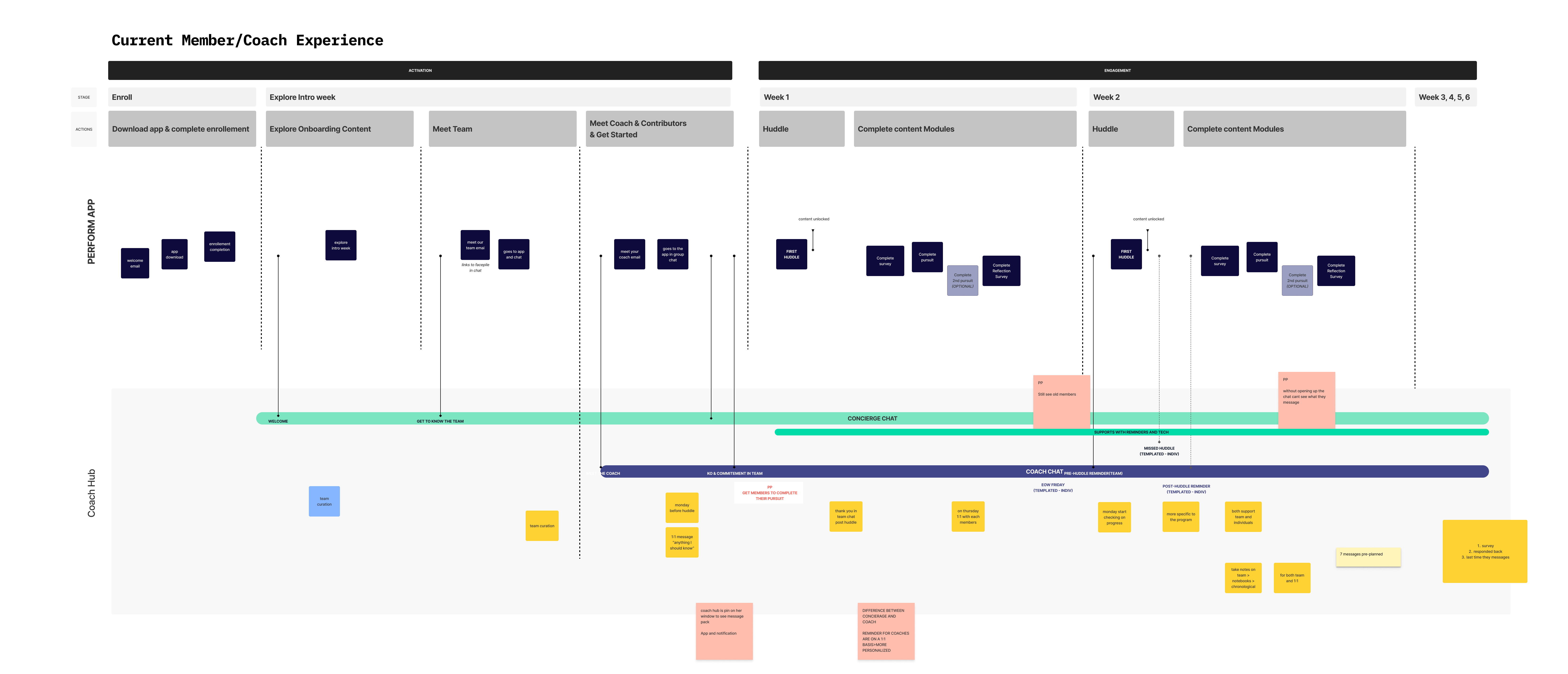
Coach interviews & synthesizing information
I spoke to six coaches and mapped out their current experience. Below are some artifacts from that exercise. The findings from this step, informed the primary use cases product management wanted to support.

DESIGN
Low-to-medium fidelity prototypes
I started design concepting around the primary use cases that needed to be supported. At this early stage, I worked in low-to-medium fidelity clickable prototypes to communicate the vision. Working at this fidelity allowed me to quickly explore the different information architecture possibilities.
There were many versions and iterations but for the purposes of this portfolio, I’m showcasing two directions that represent the bookends of the design approaches: minimal and visionary.
Design A: Minimal
Design A is a guide for the minimum effort required to support the coach’s primary use cases and stays close to the existing structure.
Jump to Minimal Design In-depth
HIGH-LEVEL CHANGES
1. Quick-filters at the top so coaches can find ‘New Members’ and ‘Regulars’ easily.
2. Chats live in a separate widget out of the member list
3. Display follow-up sessions due that day on the upper right.


Design B: Enhanced
Provides an expansive product vision with comprehensive features that go beyond supporting primary use cases.
Jump to: Enhanced Design In-depth
KEY CHANGES
- New navigation bar, creates distinct sections for key activities
- Dedicated dashboard gives a centralized view of all the things a coach needs to review

IN-DEPTH VIEW
Design A: Minimal
A guide for the minimum effort required to support the coach’s primary use cases and stays close to the existing structure.


USE CASE
I need to activate new members within 7 days of enrollment to one of my regulars.
MINIMAL PROPOSAL
The current interface does not capture whether a member is ‘new’ or ‘regular’ so at minimum allowing the coaches to:
- Quickly see a list of their ‘New’ or ‘Regular’ members via a quick filters.
- Set the status of members on the member details page
USE CASE
I want to respond to all new messages
MINIMAL PROPOSAL
Proposed is removing the chat action from the member list into a separate widget so that chatting has a discrete area. Unlike the current experience, here the coach can access new messages without having to filter the member list.
USE CASE
I want to set a follow-up with a member and be reminded when it is time to do
MINIMAL PROPOSAL
Current experience does not allow the coach to set and be reminded of appointments with members.
Proposed here, on the upper right, is displaying the first three follow-ups scheduled that day.
Coaches can set appointments on the members detail page.


IN-DEPTH VIEW
Design B: Enhanced
Provides an expansive product vision with comprehensive features that go beyond supporting primary use cases.


USE CASE
I need to activate new members within 7 days of enrollment to one of my regulars.
ENHANCED PROPOSAL
The current experience does not capture member status. Here they can easily click on ‘New’ or ‘Regulars’ from the dashboard. Coaches can also edit that status on a member’s details page.

USE CASE
I want to respond to all new messages
ENHANCED PROPOSAL
A dedicated page for messages and the ability to see details about that member without having to open additional panes

USE CASE
I want to set a follow-up with a member and be reminded when it is time to do
ENHANCED PROPOSAL
The current experience does not have this functionality. Here the coach has a dedicated page that lists ‘Today’s Follow-ups’. Coaches can initiate the video or chat from here and then mark as completed.

USE CASE
I want to see who has recent activity that requires a response from me.
ENHANCED PROPOSAL
The current experience did not display what activities members had recently completed which made it difficult for coaches to proactively reach out to members with relevant messaging. This design gives coaches more member context:
- By default members are listed by most recently active.
- 7 day trend graph gives more detail on what a member has done
- Member details that includes an activity feed and an overview of their activity.

Design exploration conclusion
The design proposals inspired more thoughtful discussions around product direction. Below are some of the pros and cons each approach presents.
| Design A: Minimal | Design B: Enhanced |
|---|---|
| + Can be implemented in the short-term since it stays close to the existing structure | – Needs a lot more user validation to get the interaction patterns right |
| + It is simpler | – Might be too feature-rich for what is necessary |
| – Might not handle a high volume of chats or follow-ups well | + Can display a higher volume of chats or follow-ups well |
| – Limited room to place other features in the future | + Nav bar allows for the addition of more product features |